Dwell
Before & After: A Super Skinny Row House in Brooklyn Gets an Airy, Loft-Like Makeover

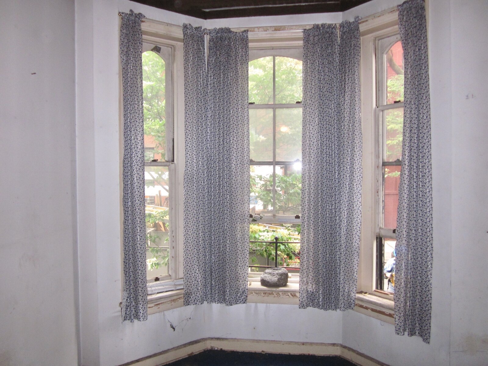
A corner townhouse that borders the Warren Place Mews in Brooklyn was occupied by the same family for generations. Architect Nate McBride, who reworked the interior, points out that the window heights get dramatically smaller the higher up you go.


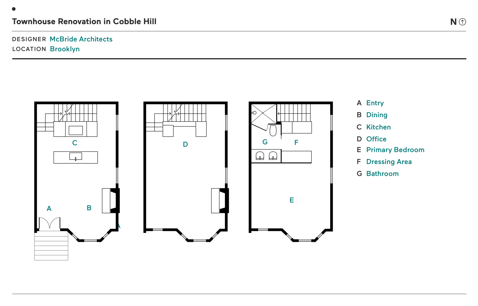
Townhouse Renovation in Cobble Hill

Townhouse Renovation in Cobble Hill floor plan

Before: The townhouse was in such a mess that the crew that hauled out its contents unearthed a piano from its depths. When it was gutted, you could look from the basement up straight to the roof. In addition to two bedrooms, the basement includes a bath and a mudroom with laundry.

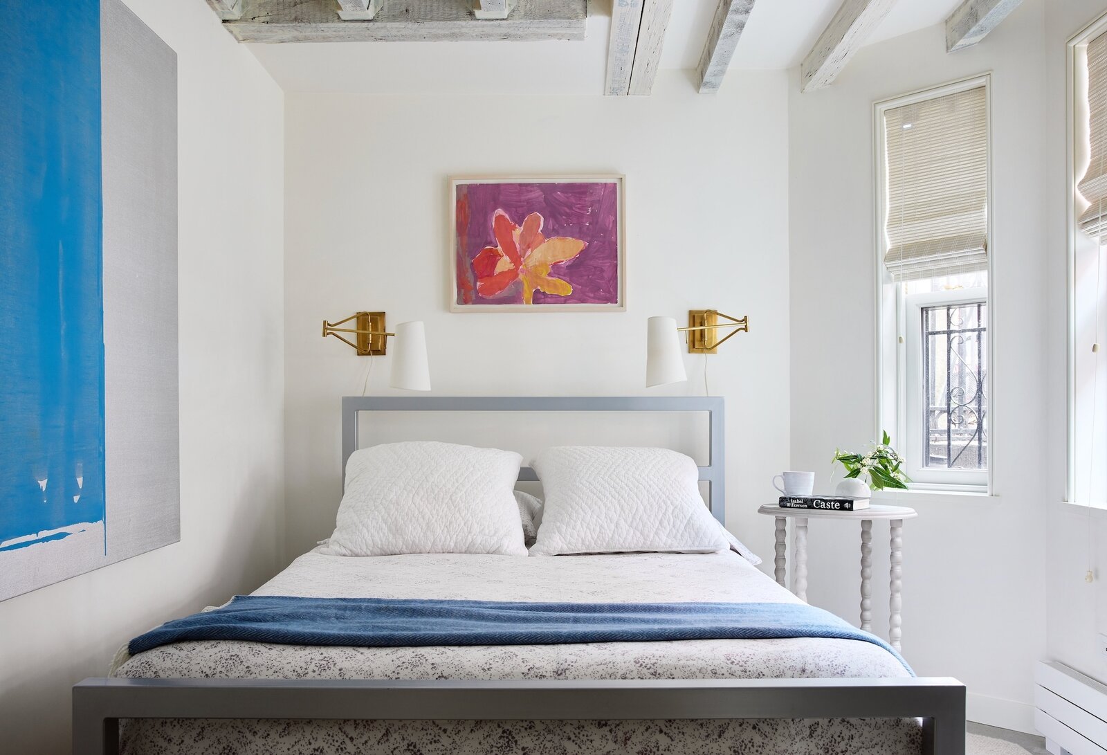
Priscilla’s 23-year-old daughter sleeps here when she visits from the West Coast. The flower painting above the bed is her childhood artwork, and the blue painting is by New York City artist John Zinsser.

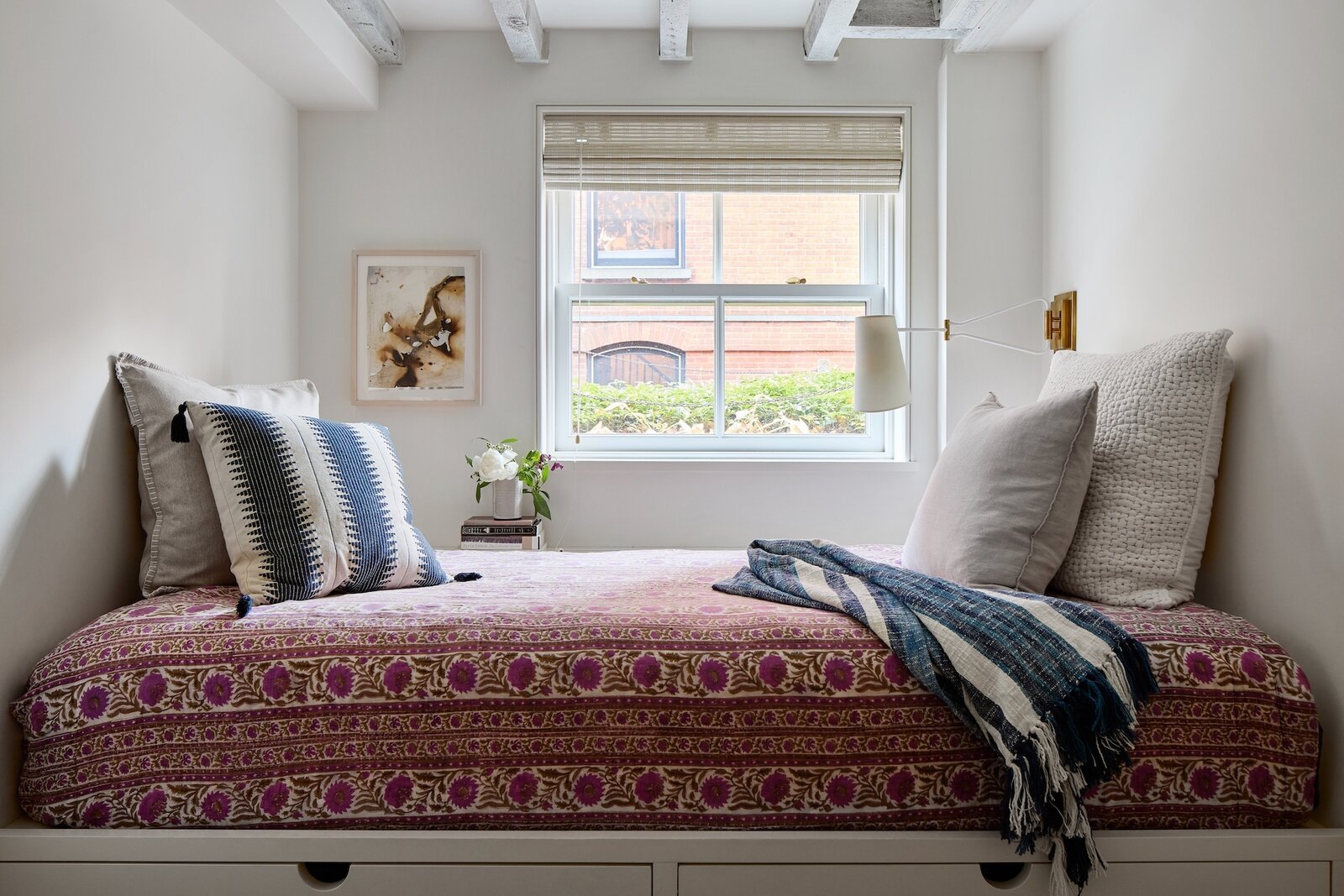
Priscilla’s younger daughter uses this room when she's home from college. "It's cozy down there and functions well," she says. The burned paper artwork is by Anna Betbeze, who is represented by Nina Johnson gallery in Miami's Little Haiti neighborhood.

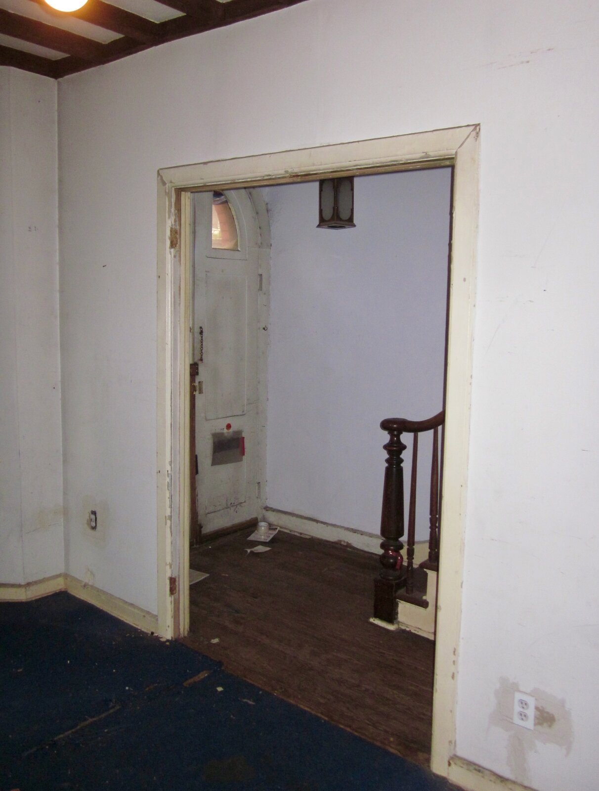
Before: The position of the stairs and corridor in the original layout ate up six of the building’s 14-foot width. "The narrowness didn't bother me, though when we drew a floor plan I thought, 'Hmmm. . . this is going to be a little challenging!'" Priscilla says.

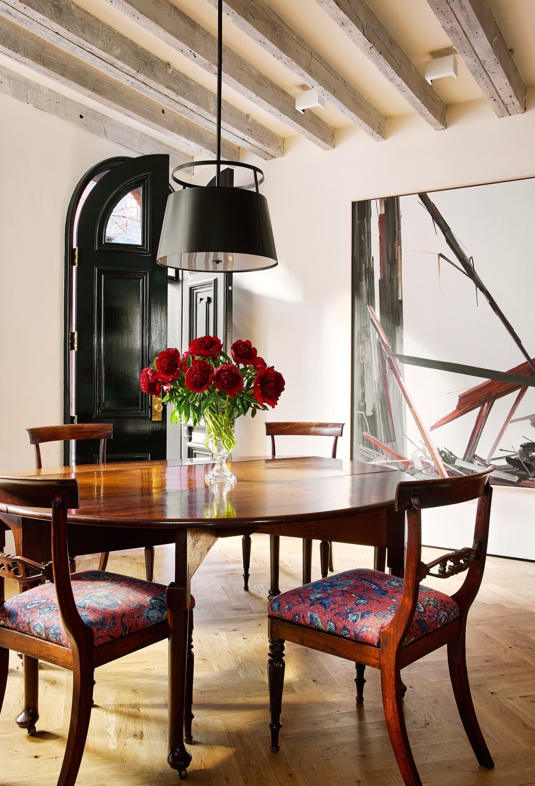
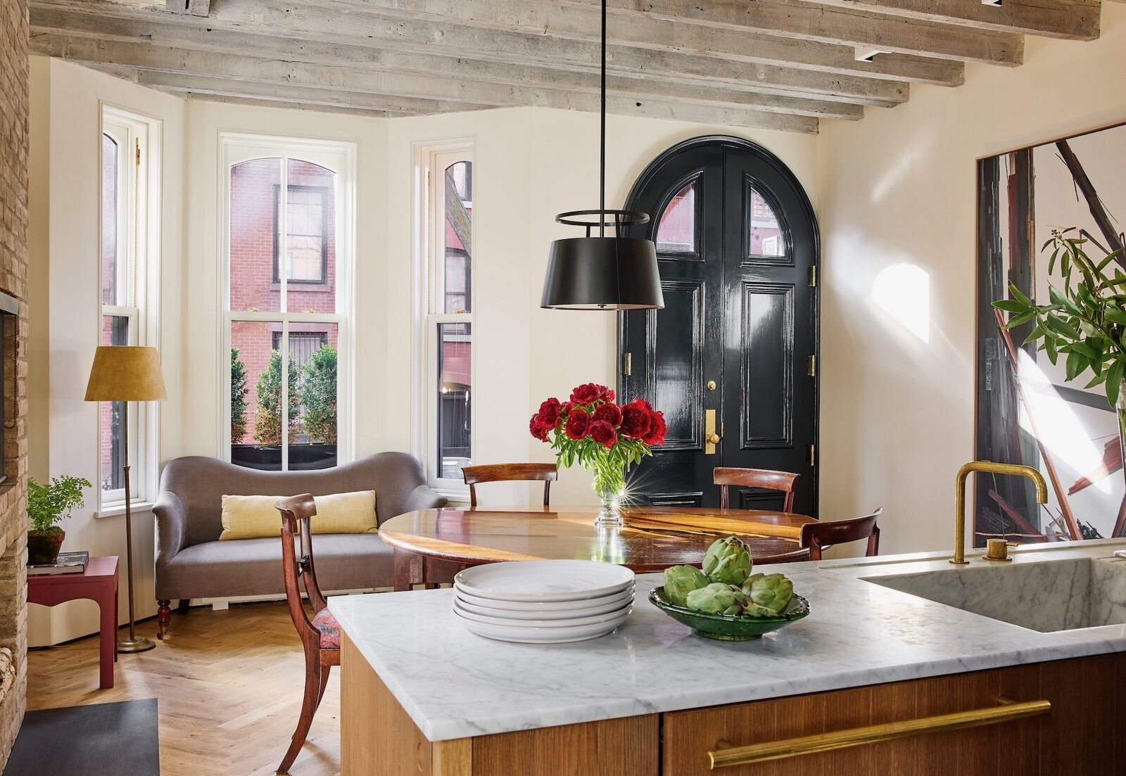
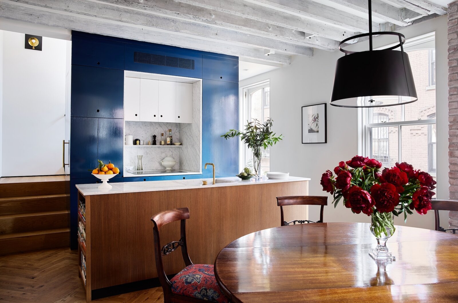
The front door opens right into the dining room, where vintage furniture creates a welcoming scene. Priscilla’s sister, Katherine Vail of NV Design, helped her with lighting and decorating. They reupholstered the seat cushions with a Chinoiserie-flavored floral fabric from Carolina Irving Textiles and chose a metal drum pendant from The Urban Electric Co. The large oil painting is by Claire Sherman, who is represented by DC Moore Gallery in Manhattan and Patron Gallery in Chicago. "Identifying a proper hanging wall for it was a priority," she says.

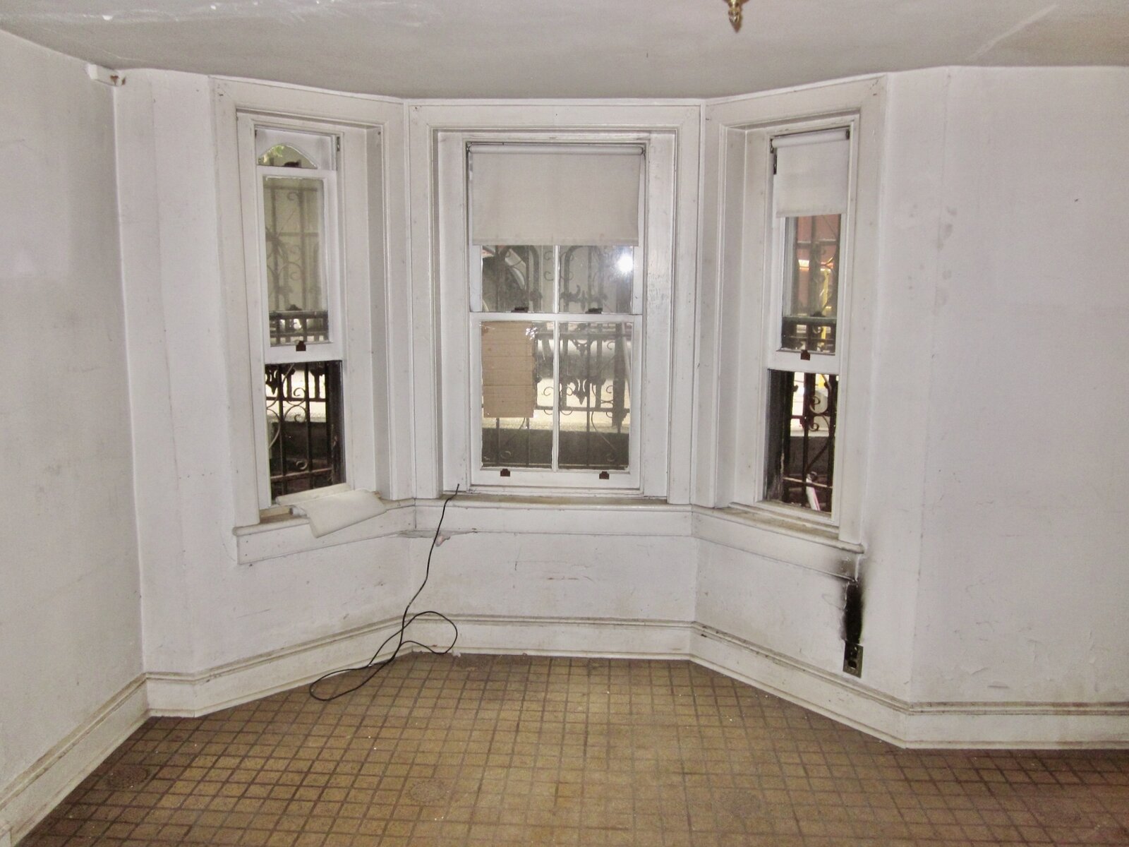
Before: The front room on the parlor level was less than eight feet wide.

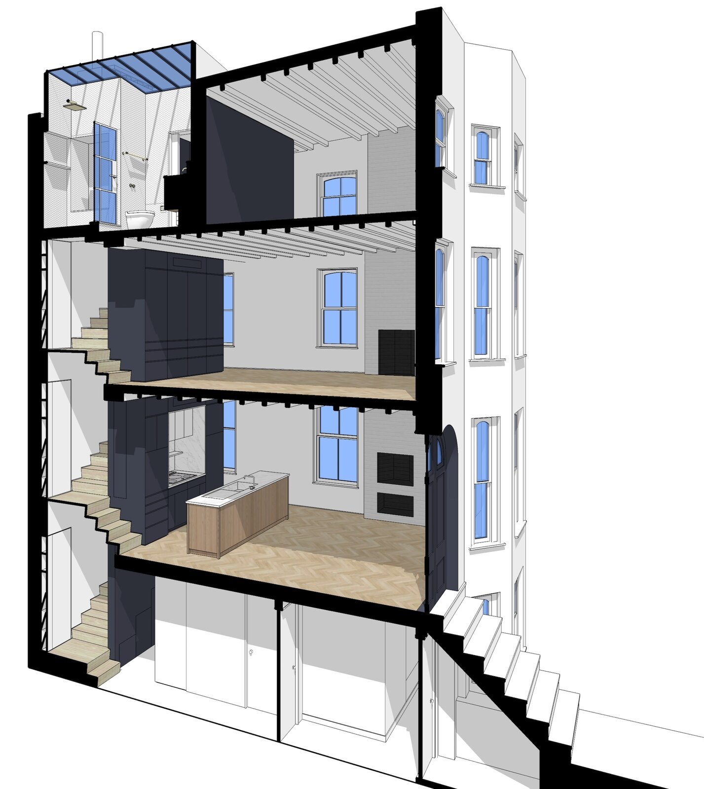
By moving the stair to the back of the house, McBride was able to create rooms that span the building's full 14 feet. In addition to being more livable, it allowed opportunity for Priscilla, who is an art consultant, to admire large artworks from a proper distance. The original arched doorway adds architectural charm as do the new weight and pulley windows from Artistic Windows. The curvy loveseat is from John Derian, and the red end table hails from an antique shop on the Upper East Side.

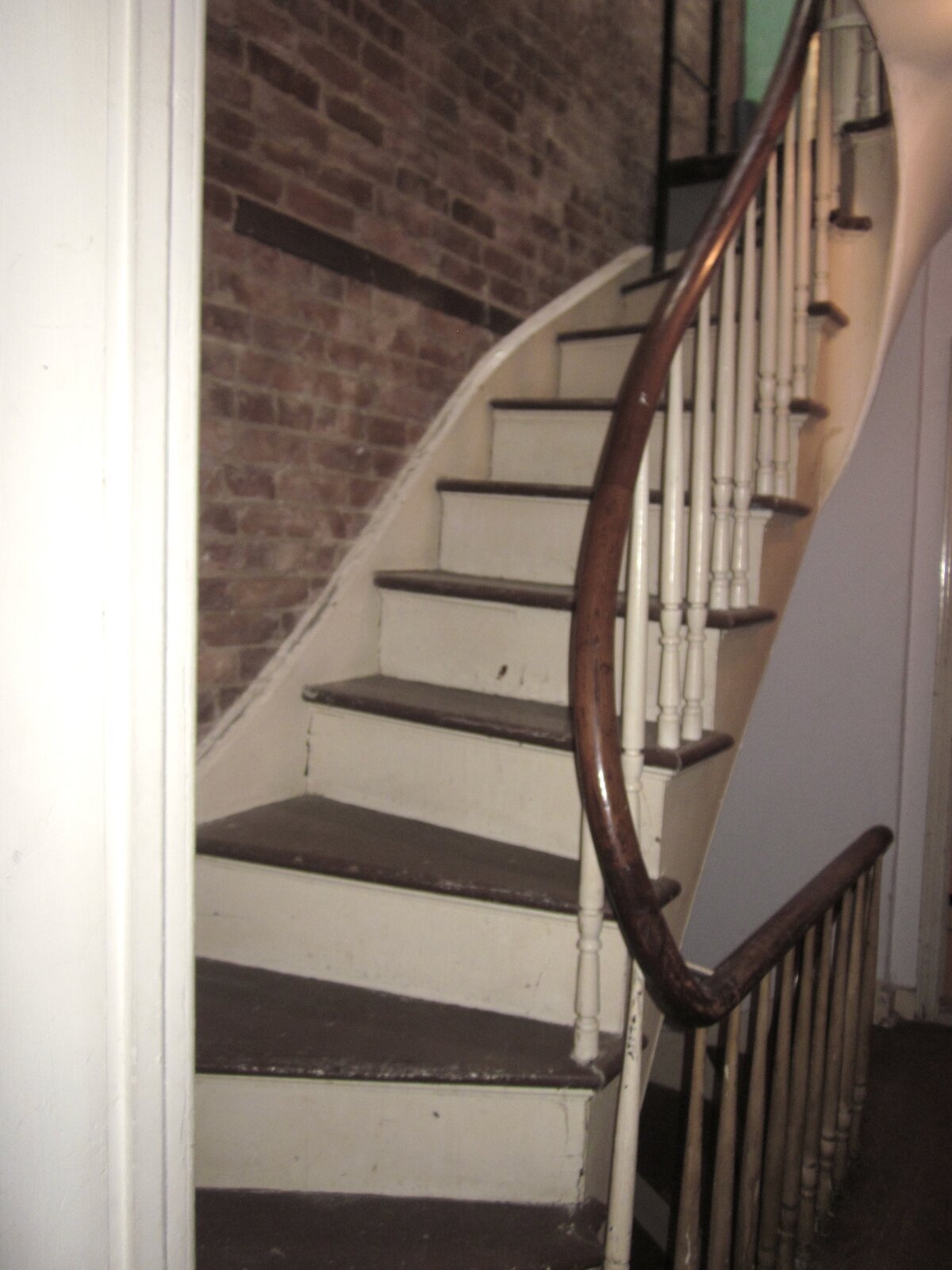
Before: Existing staircases had curved handrails and spindle balusters.

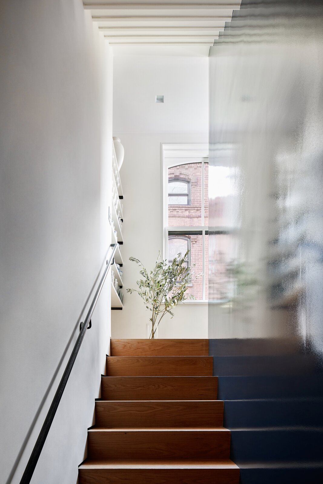
The stairs are hidden behind a core wood block with a high gloss finish for a mirror-like reflection. Fortuitously, there is a window at the top of each run. "They're not perfectly aligned with the stairs, but they bring light down at every level," McBride says.

Before: The original kitchen was in the back of the basement.

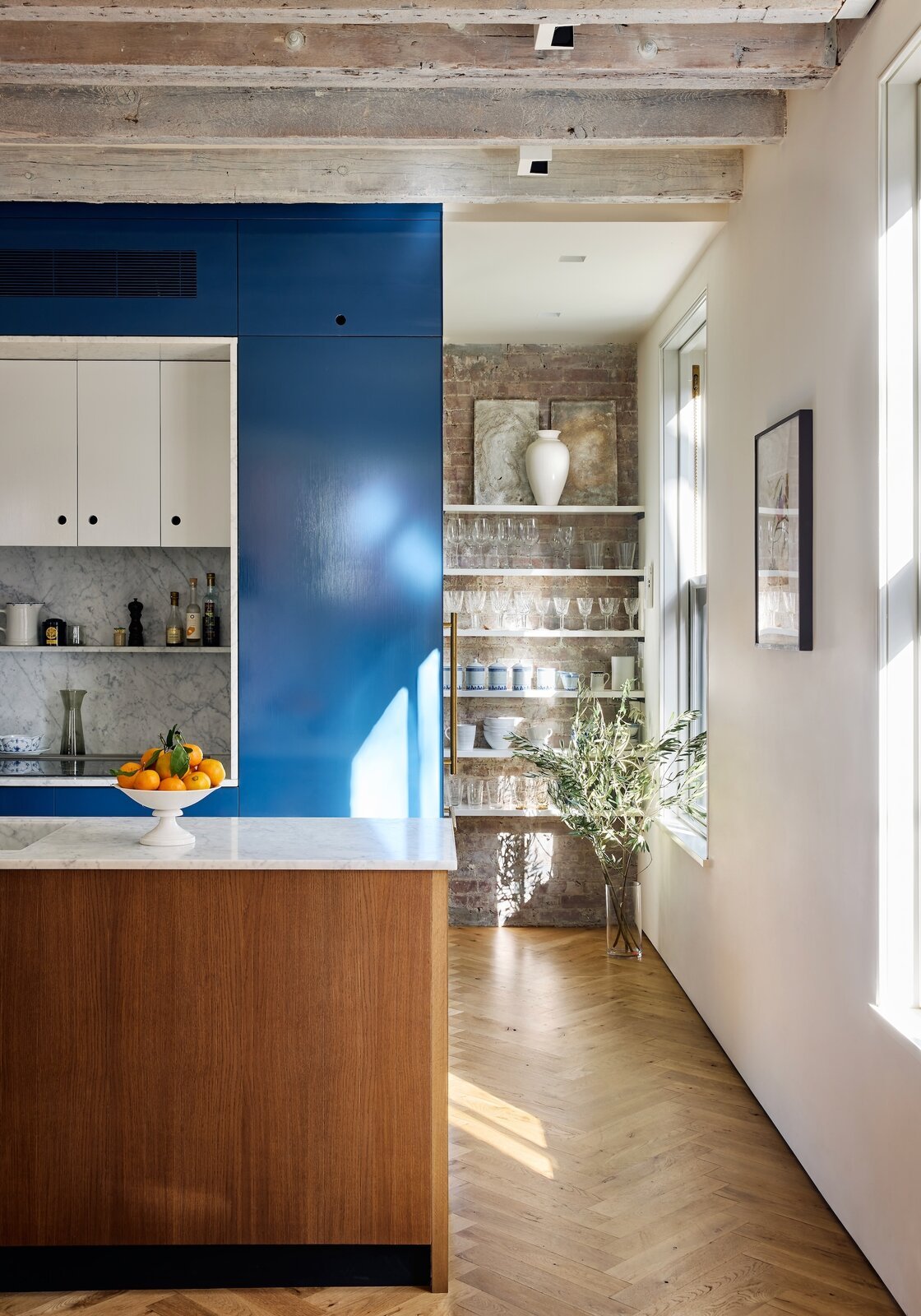
The kitchen and dining area share the parlor level. The stair runs behind the blue core, and the kitchen appliances are tucked into it. Priscilla finds the kitchen to be more efficient than her prior, much larger one. A Walton Ford print from Kasmin gallery hangs on the side wall. Priscilla is curating "Stuart Davis in Havana" at the gallery this June.

McBride installed chevron floors on the parlor level to make the space look larger. Sculptor Elaine Cameron-Weir created the artwork on the top shelf above the glasses and dishware. Priscilla acquired them from Ramiken Crucible gallery.

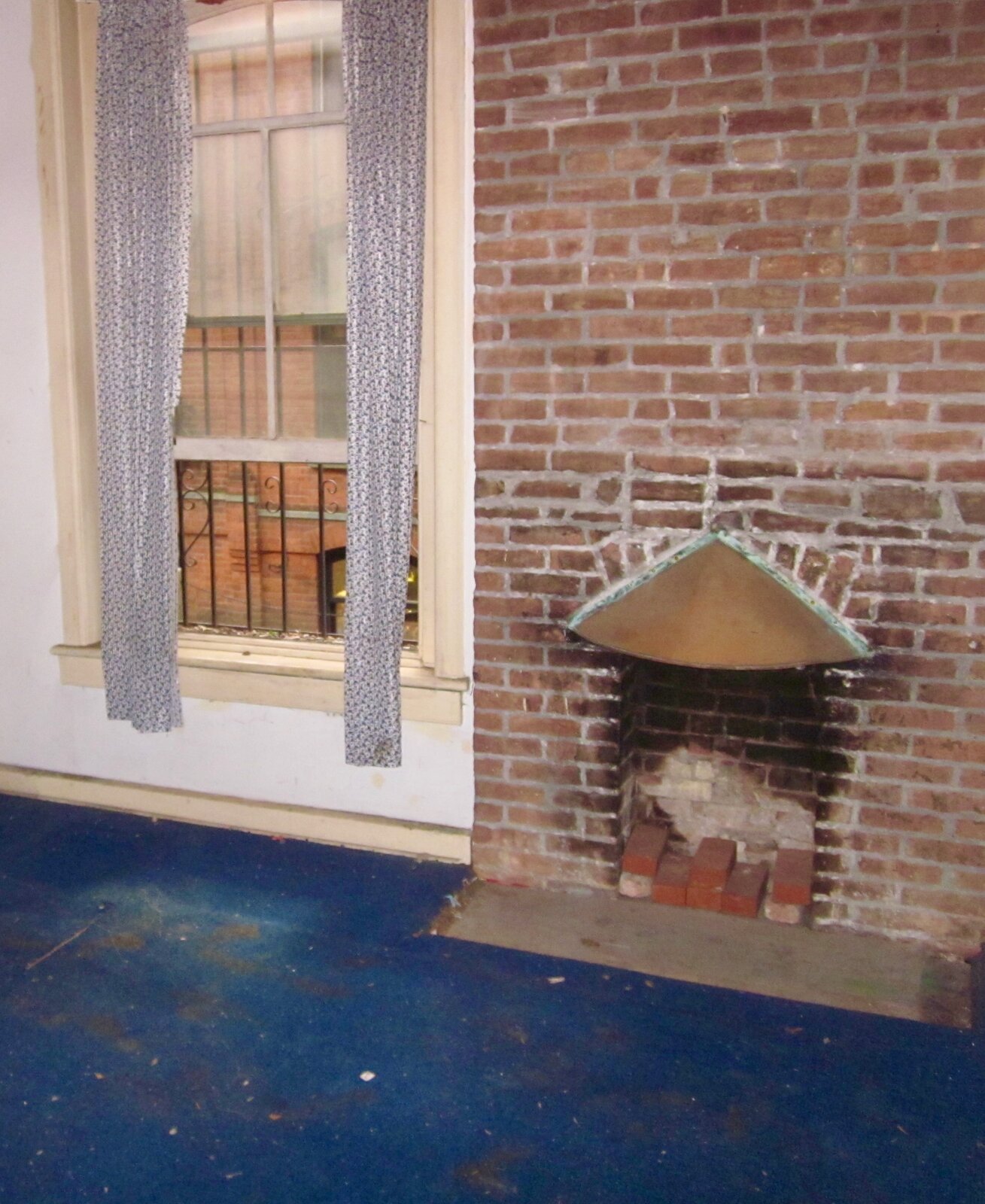
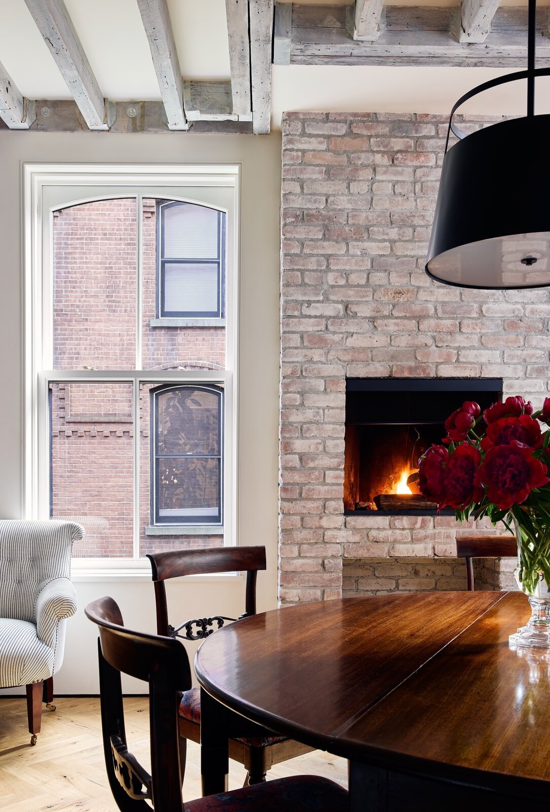
Before: The team refurbished the chimney in the front portion of the house because Priscilla really wanted a fireplace.

The windows on the parlor level stretch up to the nine-and-a-half-foot ceiling, where the team uncovered the beams and left them exposed. "Everything we did was to try to make the rooms feel more spacious and open," McBride says. Priscilla adds, "I wanted the interior to reflect the age of the house."

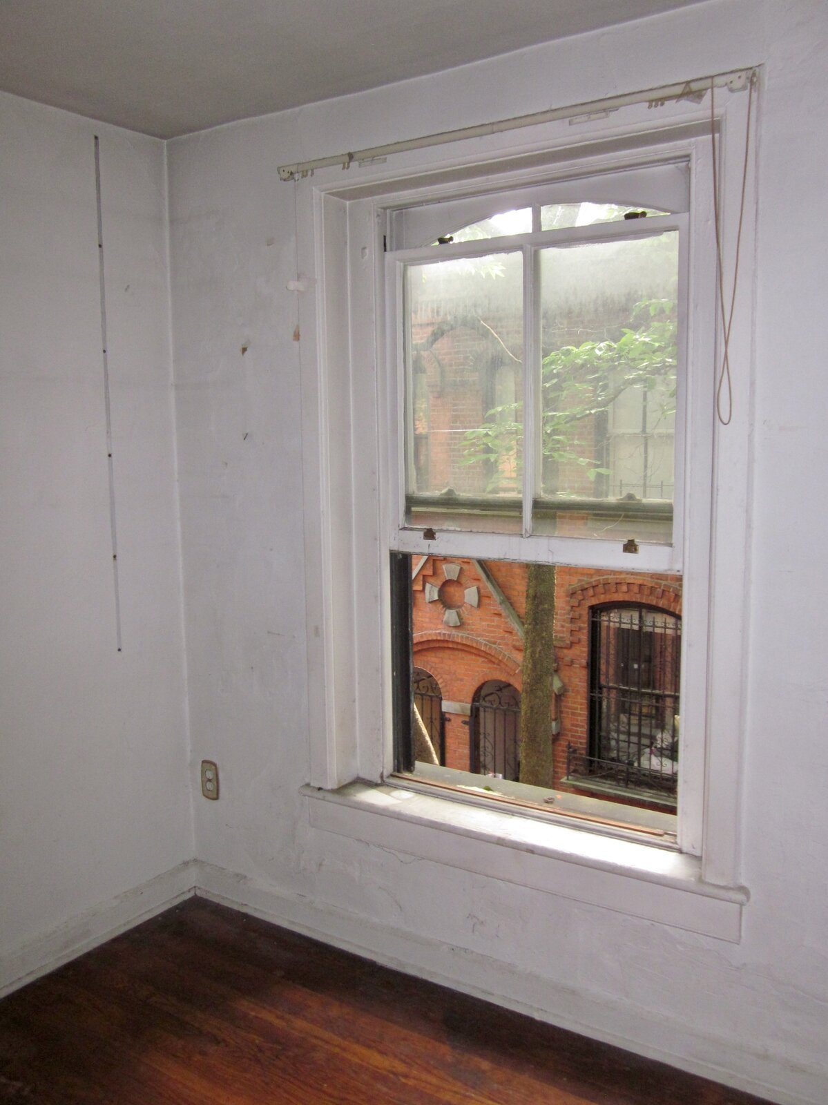
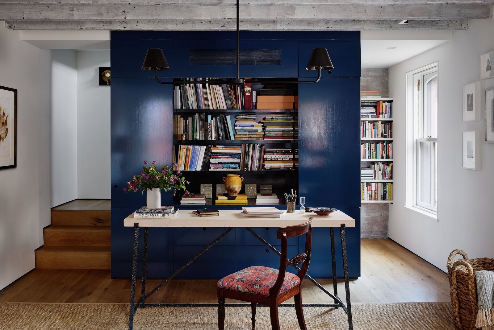
Before: The office replaced the back bedroom on the second floor.

Priscilla and McBride initially discussed the office core being an actual desk that could be closed, but opted for this setup so she could sit with her back to the books and look out the window. The double arm chandelier from The Urban Electric Co. lends a sturdy, industrial feel that echoes the metal base of the desk. "Light fixtures are an important detail that makes a house feel solid," Priscilla says.

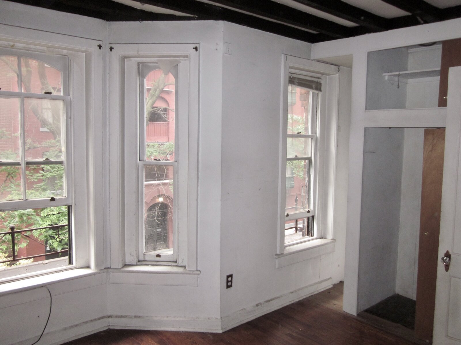
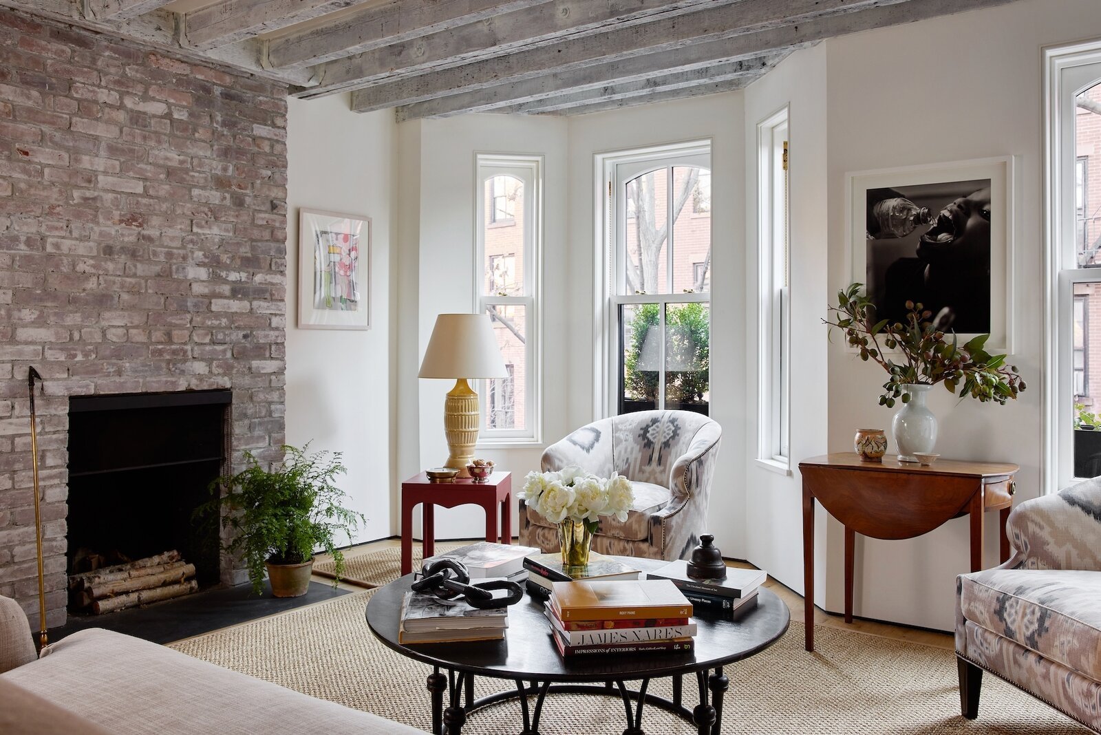
Before: The living room replaced the front bedroom on the second floor.

"It's unexpected to have the living room above the dining room," Priscilla says. "It feels very cozy." The black and white photo by LaToya Ruby Frazier is from the artist's 2016 series "Flint Is Family" documenting the city's water crisis. She is represented by Gladstone Gallery.

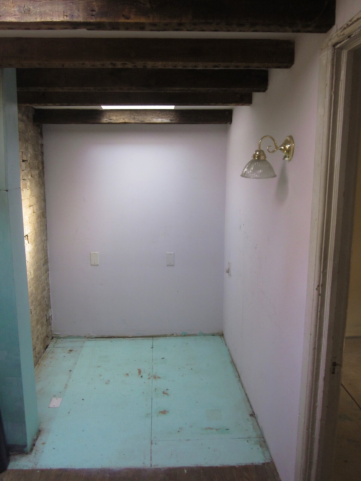
Before: The third floor landing where the shower is now.

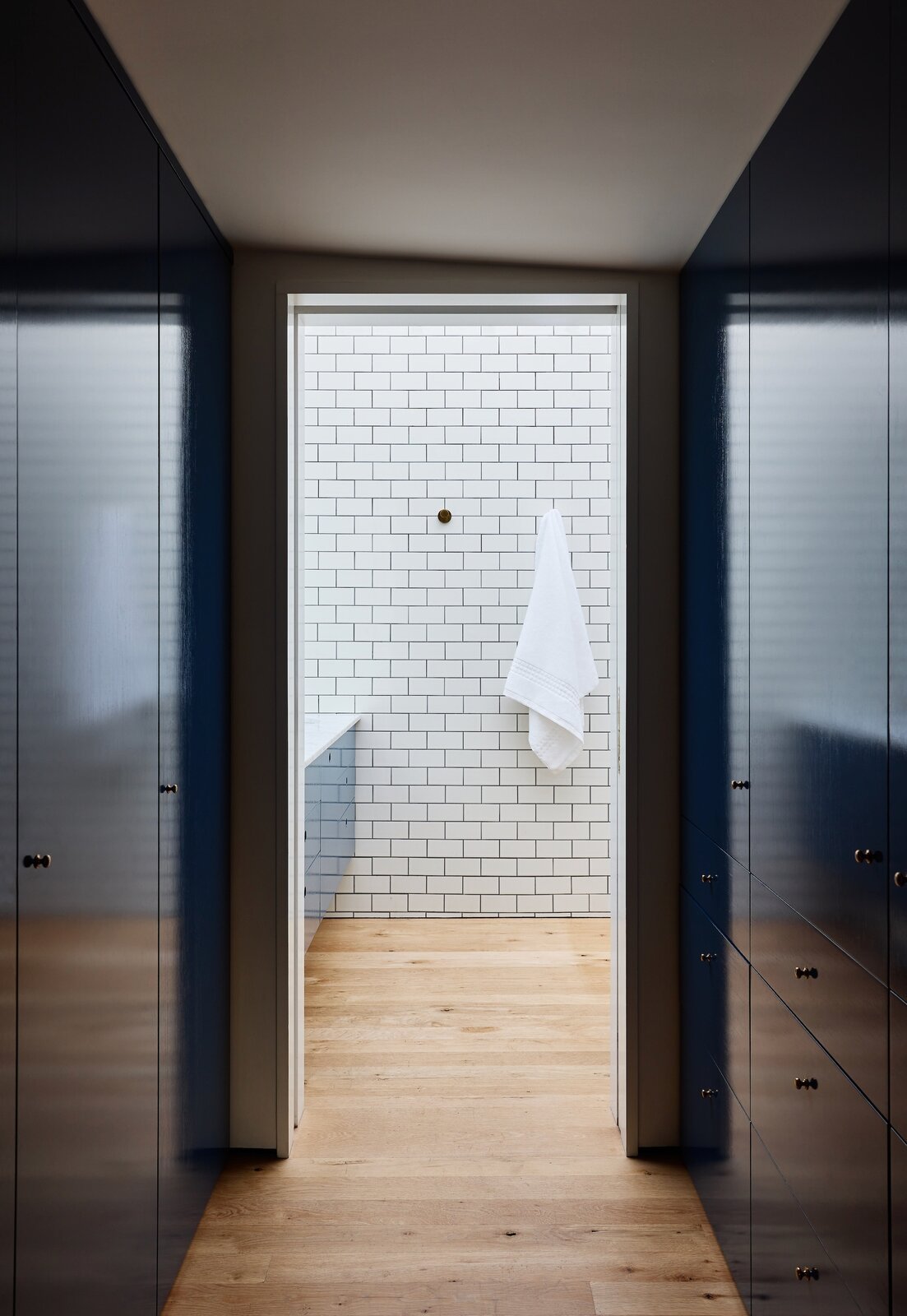
The core on the third floor is split down the middle to create a dressing room with a mirrored pocket door. On choosing the blue color, Priscilla says, "Since we were painting the whole column up through the house I wanted a color that would make a statement but adapt to the different situations. Blue works, though I almost did green. Maybe I'll repaint it someday."

Before: The team demolished the powder blue bath on the first floor and added a new bath in the basement.

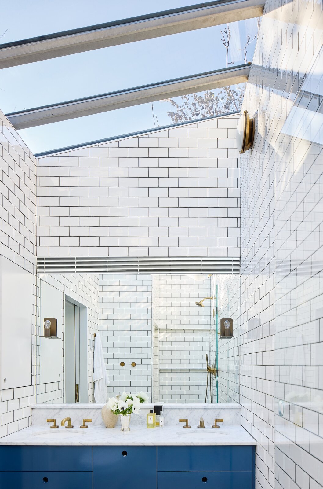
The mirror above the vanity bounces light around the room and makes it seem larger. Unlacquered brass plumbing fixtures feel appropriate for the house.

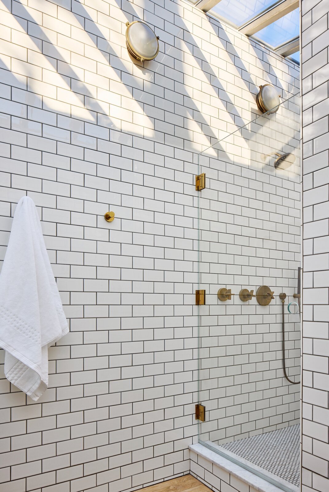
White subway tile with charcoal-colored grout covers the primary bath where sunlight streams in from overhead thanks to a huge, new skylight that is 10 feet at its highest point. Wall sconces from The Urban Electric Co. lend a nautical feel.

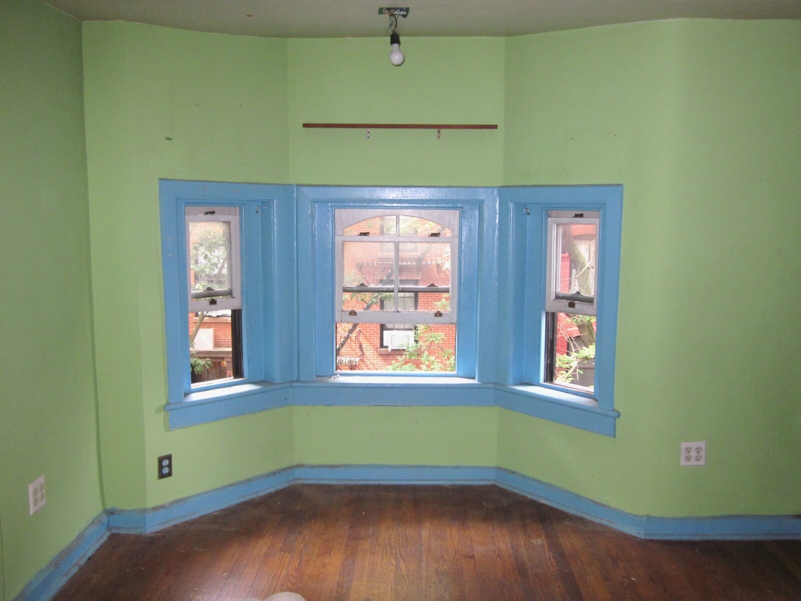
Before: The front bedroom on the third floor sported quite the color combination.

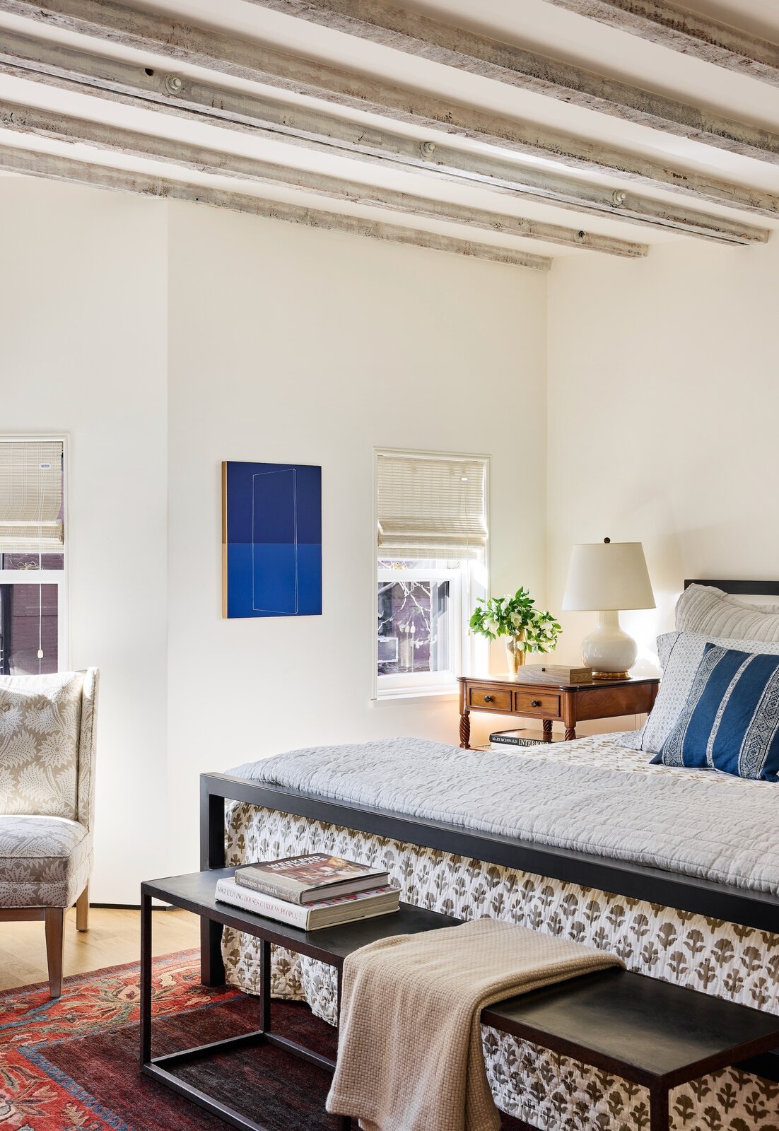
The primary bedroom has small windows but lofty ceilings with original exposed beams. The comforter is from Out of Hand in Great Barrington, Massachusetts, the table lamp is by Christopher Spitzmiller, and the vintage rug came from a dealer in Cleveland. With her daughter's help, Priscilla carried the (since reupholstered) Jonathan Adler chair home from his shop on Atlantic Avenue. "The store was closing, so the chair was so cheap that having it delivered would have cost more than the chair itself," the homeowner says. The oil and enamel painting is by Kate Shepherd from Galerie Lelong & Co. in Chelsea.
