House & Garden UK
September 2024
Interior Design: Kari McCabe
Written by: Busola Evans
Photography: Read McKendree / JBSA
Styling: Mieke Ten Have
Inside a charming 18th-century house in Connecticut with a Scandinavian twist
All too often a property hunt begins with a specific vision in mind and yet the eventual home turns out to be the polar opposite. Such is the powerful – and frequently unexpected – emotional draw the right house, once unearthed, can evoke. This was indeed the case for interior designer Kari McCabe and her architect husband Nate McBride who had set out to build “a very simple, modern home” – in Nate’s words – in a small, historic fishing town in Connecticut, USA. It is an area where Kari has deep familial roots – her parents had owned a house there in which she had spent many childhood summers and it had, over time, become a shared family holiday home.
But being the creatives they are, the couple increasingly hankered after a space in which they could forge their own design imprint. The search for land was fruitless and then, looking at houses had proven equally unsuccessful. ‘I was like Goldilocks,’ recalls Kari with a laugh. ‘This one's too big. This one's too near the highway. This one needs too much work.’
But echoing the fairytale, one turned out to be just right: a four bedroom, four bathroomlate 18th century colonial-style house in a rural idyll. With its symmetrical wood facade, large windows and a gabled roof, it was typical for the area which is teeming with homes built by Northern European settlers in the 16-1700s.
Once we walked in the door, the beauty of the house for us was that it wouldn't take very much to wake it up and make it feel like ours,’ says Kari. Another key draw was the serenity of the surroundings. ‘We're on the most beautiful road with huge large open fields and farms,’ explains Nate. ‘It's a magical ride just to get to the house.’
It was purchased as a holiday residence to provide respite from their base in New York City, but after the couple found themselves living there for two years during the pandemic, they were so enamoured they decided to make it their main home. Although there were minor structural changes, such as knocking a wall in what was previously a bedroom on the ground floor to create a ‘summer’ living room, the work needed was largely cosmetic. ‘Our design mantra was to add nothing, and subtract or edit instead,’ says Nate. To that end, a cloakroom on the ground floor was deemed superfluous, given a nearby bathroom, and its removal created more light for the living space.
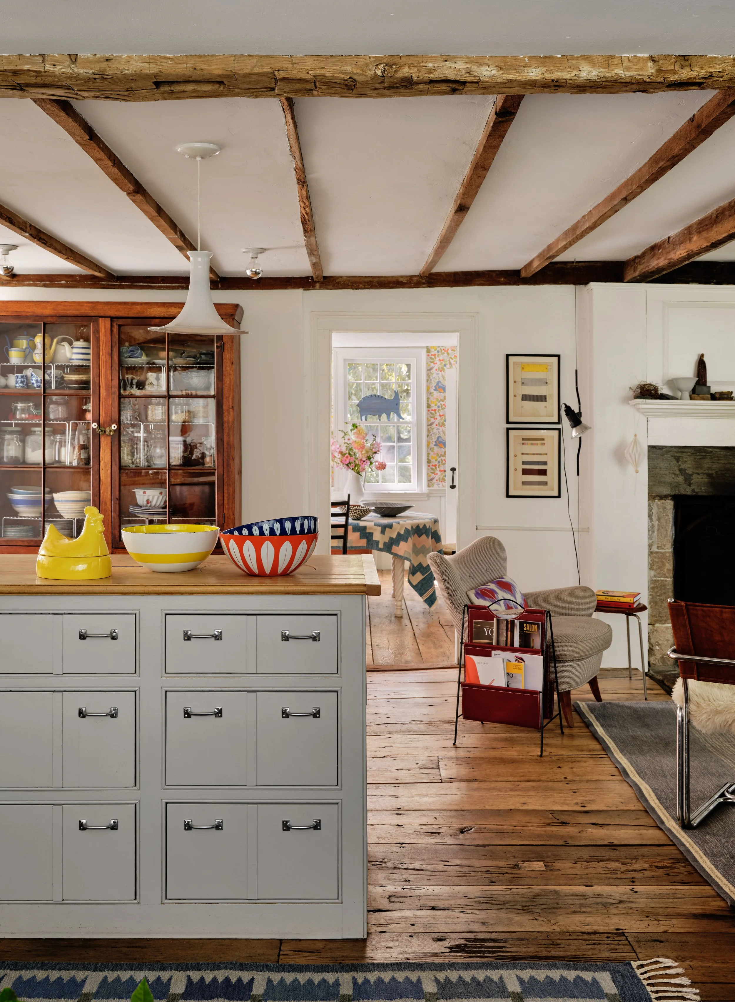
Much time was spent paring back elements added by the previous owner which Kari describes as ‘a little too historically correct’. The kitchen cabinets, for instance, required updated hardware and the existing ‘ye olde lights’ were replaced with contemporary Swedish fixtures. The exterior, a ‘mossy, yellow brown’, was repainted a fresh white from Benjamin Moore.
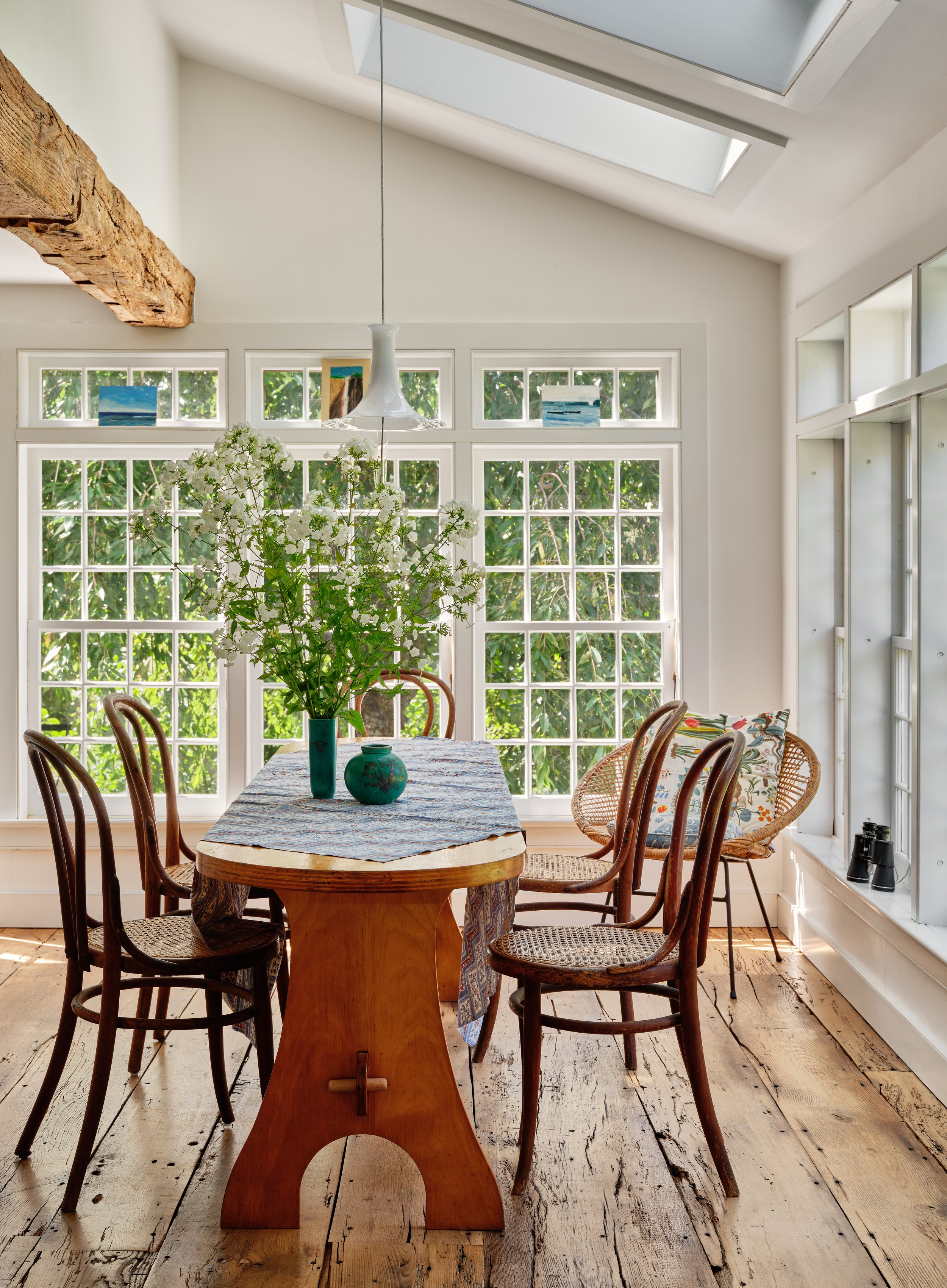
Colour and pattern is very much entrenched in the interior designer’s DNA, in no small part due to her European heritage. ‘My mother is Scandinavian – my grandparents are Swedish and Norwegian,’ says Kari. ‘So I've always been attracted to certain Scandinavian designers.’ In particular the playful patterns Josef Frank created for Svenskt Tenn. In the dining room his ‘Paradiset’ wallpaper sets a vibrant backdrop. While in the guest bedroom, the botanical ‘Vårklockor’ connects the inside to the greenery outside. Kari’s love for colour is also evident in her collection of rugs, many sourced through her own business venture, Mor Rugs, which offers affordable pieces from Sweden.
The house is entered through the mud room, where a cheerful curtain of yellow gingham is cleverly used to hide the laundry section, and leads to the kitchen which is a true exercise in how to make existing pieces sing. Upper cabinets were swapped for open shelving to give an airy feel and the heavy mossy-hued units were transformed to a light grey. ‘The stove was there and so was the copper splashback,’ says Kari. ‘We just took things out and allowed these other elements to shine because you couldn't see them.’
Most of the furniture is vintage or has been collected over the years. In the dining room, the oak table came from a house sale as did the accompanying chairs. The inviting ‘winter’ living room has two Scandinavian armchairs previously owned by Kari’s grandparents while the side tables are vintage Saarinen from Nate’s parents. In the ‘summer’ sitting room, the 30s rattan chairs – bought from an estate sale – are covered in fabric from Raoul Textiles.
‘Kari is so good at finding things that have a kind of resonant integrity and visual interest in and of themselves. She's then able to put them together in unexpected ways to create an eclectic environment that somehow all works,’ Nate notes.
Still on the ground floor, Kari’s study exudes comfort with a charming fireplace, fabric draped over a vintage chair and a Japanese chest inherited from her mother. Meanwhile Nate, in true architect style, takes a more contemporary approach in his office.
Upstairs offers more of Kari’s talent for layering colour and pattern. The bathroom is wallpapered in ‘Sandberg’ by Schumacher while the main bedroom is decorated in ‘Cecil’ wallpaper from Quadrille, and given more impact with block printed bedding. ‘I really wanted to have paper here because this is in a slightly newer part of the house,’ she explains. ‘I felt this would knit it all together. We wanted to feel some joy waking up in the morning.’
Unsurprisingly, this charming house which unexpectedly captured the couple’s hearts, has now become their forever home. ‘We ended up with a home that we didn't imagine we were going to have,’ says Nate. ‘But we came to love and appreciate it and we're able to inhabit fully in all senses of that word, physically, emotionally and spiritually.’


